Finally, I'm finished all the coding and the design.... I already package it all so, the ANDROID users can simply scan this barcode and download it.
Thursday, 3 July 2014
Saturday, 28 June 2014
IconDesign and Splash Screen
For the last part, I need to create the icon and spalsh screen for Explore Palembang.
So, this is my icon design and the Splash screen design for Explore Palembang
So, this is my icon design and the Splash screen design for Explore Palembang
splash screen
logo
Friday, 27 June 2014
Point of Interest Page
I move to the next step which is Point of Interest. In here I only put the most popular place to visit in Palembang which are Museum, Fort, Ampera Bridge, and some historical place
This is my wire frame for Point of Intererst :
Wednesday, 25 June 2014
Food Page in Dreamweaver
After I've finished the Hotel Page, now I need to faster, since the deadline is on week 14.
I design the "food" page with the same concept with the Hotel. From the references, all the wire frame in mobile apps are all 1 concept.
I design the "food" page with the same concept with the Hotel. From the references, all the wire frame in mobile apps are all 1 concept.
All the information include location and contact information in one page.
Sunday, 22 June 2014
Test on the Android using Phone Gap
After I finish several pages, I tried to packaged it by using PhoneGap from Adobe.
The first step is to zip all the folder in to one zip. The file must be less than 15mb. After that, the next step is upload the file in to the PhoneGap builder. At last, scan the barcode that has been created by PhoneGap by phone, after scan it, the apps will automatically download.
So this is the screen shot for Explore Palembang Apps in my phone
Thursday, 19 June 2014
Finish the Hotel Page
After I put the maps on the Hotel Page, and do the testing so many times, and now my Hotel Page has finished, with all the information inside that, hope it can help tourist. Total 9 Hotels.
Wednesday, 18 June 2014
Continue Hotel Page
After 1 week I've worked on this, finally I finished all the information about hotel include the gallery and contact information. The button works fine, and when the user click in to one button then it going to the other page which is information about the hotel .
Sunday, 15 June 2014
Put the Maps for the Hotel Location
I need to put the Hotel Location as well, so the user can easily find the location of the hotel and the maps can help the user by navigate them to their hotel destination.
I was thinking of using third party application which is google maps. So I try to put the static image in my Hotel Information, once they click, it will automatically jump in to the Maps Page.
The first step is I go to the google maps and find the Hotel from the search engine
After I found the hotel location, then I copy all the link above and then paste it in to my coding
I was thinking of using third party application which is google maps. So I try to put the static image in my Hotel Information, once they click, it will automatically jump in to the Maps Page.
The first step is I go to the google maps and find the Hotel from the search engine
Once I paste it, when I click to the Maps Static Image, it will automatically open the new tab and go to the Google Maps.
Saturday, 14 June 2014
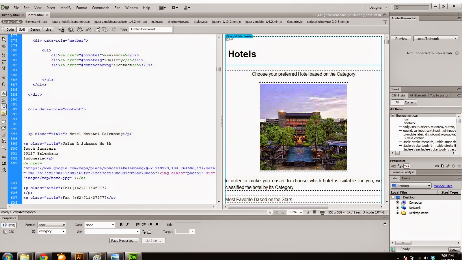
Designing the Hotel Page and create it in Adobe Dreamweaver
Since I already pick the colour which are red and white, it's more easier to me to think about the wireframe for Hotel Part.
On the Hotel part, there will be 2 button to represent the hotel, include Most Favorite Hotel and Based on the Star.
On the Hotel part, there will be 2 button to represent the hotel, include Most Favorite Hotel and Based on the Star.
Since there are many information inside that, it takes me more time to finish it.
Thursday, 5 June 2014
About Palembang Page in Dreamweaver
After I finished the homepage, then I move to the next page which is About Palembang.
Luckily, all the coding looks fine and work properly.
Saturday, 31 May 2014
Fix the problem for index page
After I look in through the coding, all the coding looks fine, then I open my Adobe Illustrator File and I found that the problem is from the resolution of the symbol is too low . So, I redo the symbol, change the resolution and enlarge the size of the symbol.
Then, I try to reload it on Dreamweaver, and finally it looks fine .
Then, I try to reload it on Dreamweaver, and finally it looks fine .
Thursday, 22 May 2014
Start to bulid the index page i Adobe DreamWeaver CS6 and got error
I haven't done all the design yet, so I try to create the homepage for this apps.
I create the new file in HTML5 , and then I insert the jquery mobile Page to create the index page.
At the first step, I'm going to the http://themeroller.jquerymobile.com/ to pick the color that I've chosed before for my apps.
So this is the screenshot when I pick the colour from Jquery mobile themeroller
After I pick the colour, then I download the theme in packages and combine it with my apps folder. After it, I call the jquery theme from the index by putting some coding, so all the theme can be used in all pages.
After I put all the coding , then I start to put the button and the content inside this index page.
For this page, I put Ampera Bridge as the Landmark of Palembang. by using "img class and css code" , I can adjust the position and do the responsive page.
After I create the button and put the symbol as well, I got a problem , my symbol are pixelated and the hotel button is too small. So i need time to redo some coding and try it again.
Friday, 9 May 2014
Redo and finalized the Screen Design
After I do some research one more time, I found that the colour must be simple so, people can focus on the content inside the apps. So, rather than use many colour color, I only use 2 colours in my Mobile Apps which means red and white.
This is my design for the home page
This is my design for the home page
I use red colour for header and the footer while the button I use white colour. The colour match and I continue my work to the other page.
There is two option on the header and the footer colour. Still need to do the trial and error in Adobe DreamWeaver whether the colour match or not.
Sunday, 4 May 2014
The other design
I have choose another colour, but the layout is still the same. Need to finalized it before mid break -.-
Change the design
I was thinking to use 2 colour as the main theme, but I'm still confused which colour is nice. So. I just do the trial and error, mix and match the colour and do the layout until the restaurant part. Hopefully I can fiinish my design before mid break semester. Hahahaha...
Mrs. Anis Ismail : I need your comment hahaha Confused about the colour choosing.
Mrs. Anis Ismail : I need your comment hahaha Confused about the colour choosing.
I was trying to use black as my background, but it make me more confused, is it nice or not. Still need do the colour matching. The layout will be like this, quite simple and easy user
Sunday, 27 April 2014
Start Designing the layout
I try to start this project. Starting from the Main Page and the Introduction Page. It's not finalized yet, still need more time to choose the colour. These are the layout design that I've done :
Visual References Design
For the designing part, I've found some visual references that can help me on designing Explore Palembang mobile apps. These are some of my references :
This example is for the main page which is the Homepage. Quite straight forward and user friendly.
Subscribe to:
Comments (Atom)


